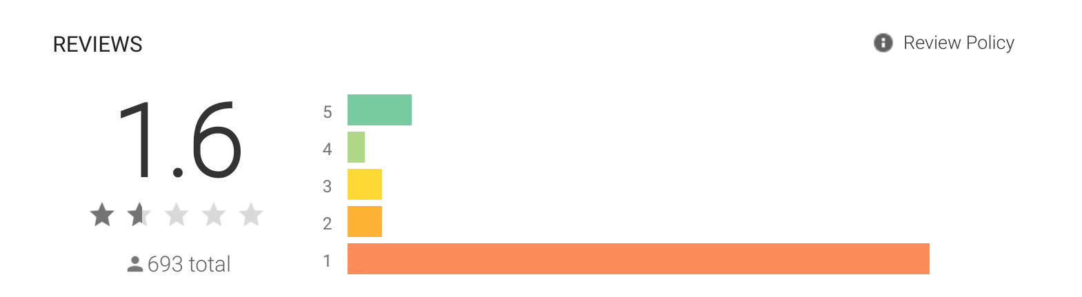
Saturday, 18 May 2013

The New Navigation Drawer Design Pattern

In the latest Android design guidelines update Google added a new pattern: Drawer Navigation. The pattern was also covered in the Android Design for UI Developers Google IO talk.

In this post I'll take a look at the details of the pattern and how it differs from the drawer navigation use we have seen on Android before.

The state of the drawer navigation, before

This isn't a new pattern on Android. It's been used for a long time by some apps including many of Google's own apps. There's also 3rd party libraries implementing the pattern. But all of them function differently and and look different. This leads to user confusion. There was no way of knowing what to expect in apps. In some apps the drawer navigation was only available on the top level pages while on some apps it was always accessible. Some apps supported bezel swipe for opening, some apps opened it with any vertical swipe and some apps only opened it by tapping the app icon.

Even on Google's own apps things were inconsistent. In the YouTube app you can open the drawer by swiping from left to right and the action bar stay put. On G+, on the other hand, swipe doesn't do anything and the action bar moves with the content.


Android pattern evolution - by natural selection

One of my favourite things about Android is the way the design language evolves. Google's approach has been not to enforce style or patterns to users. They do publish design guidelines but the guidelines only touch areas that have been established and new patterns are added fairly late. The Google Android design guidelines are not there to show the latest and most innovative patterns and that job is left to the Android app community.

Android pattern evolution is not a new trend. Things like action bars etc. were first introduces by third party apps, not by Google. From there by use of multiple apps and multiple different implementations the best ones survived and became standards and guidelines. in fact, Google has crowd sourced their pattern innovation. And this is a good thing! One company cannot produce as much innovation as a crowd of people and companies. This way the patterns that survive and the implementations of those patterns are likely to endup being better. They've already been tested by users.

While innovation and multiple implementations of patterns is good for beginning at some point a dictatorship of design is needed. This is when Google steps in and chooses the best way for a pattern to be used. There's always room for argument even after the pattern is made official if the selected way is the best or not. The pattern evolution doesn't stop when an official guideline is made. But at that point we start moving towards platform consistency.

This open exchange of ideas leads to much faster innovation on the platform than a dictatorship model from the beginning. Looking for proof? Just take a look how Android looked just few short years ago.

What's new?

Let's take a look how the drawer navigation looks in the design guidelines and hopefully soon throughout Android apps. At the time of writing this only few apps have been migrated to the new implementation. Namely, Google Books and Google Music. If they're available in your country they're good examples how to use the new pattern in practice. I expect rest of the Google apps to be updated soon as well. There's also example app available from the Google documentation (source code zip).

[Edit] Google Earth and Google Shopper are also using the new navigation drawer!

Firstly, take time to read through the guideline. You'll find it here.

I won't be repeating everything in the guideline but I'll bring up some points that I found especially interesting and few points that have changed a lot.

Drawer navigation, action bar and app content

In the new drawer navigation action bar stays on top and does not move away. The drawer navigation also slides on top of the content instead of the content sliding away like in some of the previous implementations.

There's a good reason for both of these changes. The drawer navigation is part of the chrome and not part of the app content or structure. So the navigation drawer is no-longer seen as replacement of the old dashboard (although it does replace the same functionality) but instead of a control that is not in the app hierarchy just like the action bar. 

Here's few screenshots of the apps that already implement the new pattern. I've also created an animated gif showing the different stages. You can find it here.


Access everywhere

One thing I brought up in the previous time I talked about this pattern is the ability to access any top level content from anywhere from the app no matter how deep level you're in. However, most of the previous implementations did not support this feature as they were still just replacing the old dashboard. 


I'm happy to see that the new pattern guidelines adress this issue as well! The guidelines suggest that you enable the drawer navigation throughout your app and let users invoke it with a bezel swipe. For example Google Music already does this. You can use bezel swipe to quickly jump to any of the top level screens of the app.


Action bar is for actions, drawer navigation is for navigation

I think that the drawer navigation is a bit over used in apps nowadays. It is worth remembering that patterns should only be used if your app has the problem the patterns solves. Google introducing this as an official pattern does not mean that every app now has to use it! It is a navigation pattern that allows you to create a flatter navigation structure to your app. If your app only has one or two top level hierarchies using this pattern probably won't make your app better.

Some apps try to add too much different things to their drawer navigation. It is not for actions. There's already a place for actions in your app and that's the action bar. Try to keep the drawer navigation for navigation!

Drawer navigation icon

On of my pet peeves in the old implementations of the drawer navigation has been the overloading of the up-indicator. This issue is addressed as well in the new guidelines. When the app icon (home button) is not an up navigation button but instead opens the drawer navigation the icon is replaced with the drawer navigation icon.


The drawer navigation implementation page provides a link to a zip file for the default drawer navigation icon in both light and dark holo theme. Google does recommend you to customise your icon to match your app's theme. It's worth keeping the look otherwise similar to maintain platform consistency.


Improved discoverability

Discoverability is one of the weak points of this pattern. I believe that he change of the up indicator to drawer navigation indicator alone will help alot. But there's few other things Google recommends you to do when using this pattern.

First time app launch

The guidelines mention that you could consider making the drawer navigation open by default when the user first launches the app. That should make the idea of the drawer being there more obvious.

Peek

Another idea in the guidelines is that when user taps and holds the left side of the app the drawer should open slightly to give the user a hint of its presence.

Drawer navigation checklist

The design guidelines list a handy checklist to see if your implementation matches the pattern definition. This list can also be found at the bottom of the drawer navigation guideline page.


  • The action bar remains in place and adjusts its content.
  • Your navigation drawer overlays the content.
  • Any view represented in the drawer has a navigation drawer indicator in its action bar that allows the drawer to be opened by touching the app icon.
  • You take advantage of the new visual drawer transition.
  • Any view not represented in the drawer maintains the traditional Up indicator in its action bar.
  • You stay in sync with the general navigation patterns for Up and Back.

Potential confusion

There is another pattern that have been used in Android apps although not very widely. It is the sliding pane layout. This is a responsive design pattern designed to help implement UIs that work well across the wide range of Android devices. In the sliding pane layout the structure is very similar to the drawer navigation but it's use is different. It's an alternative approach for implementing the common master/detail pattern. The Sliding Pane Layout is also available in the latest support library.

The potential user confusion can come from the similar interaction of these two patterns. If you implement both of them in the same app be careful and test the app on real users before publishing it. Also, take great care doing the visual cues correctly. In the drawer navigation the drawer slides on top of the content but in the sliding pane layout the lower level content overlaps the higher level content (this is very similar to activities appearing on top of previous activities).

Take a look at the Google IO presentation about the sliding pane layout to get a good overview of the differences. Here's a direct link to the relevant part of the presentation: http://youtu.be/Jl3-lzlzOJI?t=16m20s.


Implementing drawer navigation

Implementing drawer navigation is simple. The components required are now included in the latest support library. This means that you can start using the official drawer navigation implementation in your apps regardless which Android versions you target. You'll find examples as well as detailed implementation instruction in the Google's Android training session here.

Mark Allison has also started a series of post in his awesome Styling Android blog about implementing drawer navigation. At the time of writing this he has published the part one. This series is definitely going to be a great source about the implementation once completed.

Conclusion

In short, the new drawer navigation is a huge step forwards. I'm fan of it and recommend using it when you app needs it. Read the guidelines carefully and use the official support library implementation.

Friday, 17 May 2013

Watch this: Google I/O 2013 - Android Design for UI Developers

Google I/O 2013 session Android Design for UI Developers by Nick Butcher and Roman Nurik is now available in YouTube.

If you read my blog you're likely going to find this presentation very interesting as well as informative. Nick and Roman cover very important topics for bot designers and developers. I highly recommend taking the time to watch it.


You can find the talk slides at this Nick's G+ post: https://plus.google.com/u/0/+NickButcher/posts/dLYxYwoZfFP

Wednesday, 15 May 2013

Navigation Drawer gets official Google guidelines

Finally, the pattern that is now called Navigation Drawer has got official guidelines from Google. This pattern has become very popular in apps but the implementation has been very different due to lack of official support. Now the situation is changing and not only has Google released design guidelines but also they've also released support library update allowing devs to build their apps in a unified way.


Navigation Drawer design guidelines
Creating a Navigation Drawer

Now lets see what the rest of the Google IO brings :)

Sunday, 12 May 2013

Get Ready for Google I/O

Google I/O is the annual Google developer events in San Francisco. This year's event is just few short (long) days away. On top of new release announcements we're going to see many good presentations covering large range of topics from technical to designy.

As the Android platform has matured the IO talks have gradually been including more and more design topics. This year is no exception. Here's some talks I'm particularly exited about. (But don't forget to check out the agenda at https://developers.google.com/events/io/sessions#t-android.)


Android Design for UI Developers

By Roman Nurik, Nick Butcher.
Link: https://developers.google.com/events/io/sessions/326204977
Design on Android is no longer a complex mystery of disjointed patterns; the Android design guidelines have paved the way for a design renaissance following the tenets of content forward and responsive mobile design. In this talk we'll explore the arsenal of tools available to Android UI engineers that let you implement some of these important guidelines, including responsive design with multi-pane layouts, metrics and layout grids, and core navigation components.
Nick and Roman have been active in the Android community pushing design topics. Their Android Design in Action video podcast has been helping developers and designers alike to understand where the platform design language is heading to. I expect to see a lot of interesting information in this talk.


Android Graphics Performance

By Chet Haase, Romain Guy
Link: https://developers.google.com/events/io/sessions/325418001
Engineers from the Android UI Graphics team will show some tips, tricks, tools, and techniques for getting the best performance and smoothest UI for your Android applications.
Chet and Romain have probably more in depth understanding of the inner workings of the Android's UI framework than rest of the world put together. This presentation will be a must for all developers working with UIs. Designers can probably safely skip this session.


Android Protips: Making Apps Work Like Magic

By Reto Meier
Link: https://developers.google.com/events/io/sessions/326454327
Learn how to use advanced Android techniques to build apps so good, people think they're magic. Featuring advanced coding tips and tricks, implementation patterns, and exposure to some of the lesser-known APIs, you'll gain insight into how to build context sensitive apps that delight your users without draining their battery.
Reto's talks have been very useful every year. He usually brings up topics you might have heard about but don't really know that they could have helped you solve issues much more easily than the manual approach you took in the project. This is another must one for every dev working with Android UIs. This information is something that developers must know about when there's a discussion what is possible and what isn't in early phases of new projects.


What's New in Android Developer Tools

By Xavier Ducrohet, Tor Norbye
An in-depth tour of the Android development tools, with a closer look at everything new - along with tips and tricks for getting the most out of them.
Not only are Tor and Xavier very good presenters but their approach is to show more and explain less. This talk will probably give you a very good understanding how you can improve your usage of the Google's Android tools. I'd recommend this session to designers as well to get a good overview of how developers are building the UIs.


And tons more!

As already mentioned this year we'll see much more design topics than any year before. Here's few other picks.
Cognitive Science and Design
Agile UX Research Practice in Android
Structure in Android App Design

Unfortunately, I won't be in SF this year but I'll be watching the live streams as well as recordings. I'll post more recommendations in couple of weeks after the IO based on the sessions.

Exiting week coming for everyone involved in Android design or development!

Friday, 19 April 2013

Cheatsheet for Android Graphic Designers

When creating visual assets for Android apps there are tons of things to remember from screen density, icon standard sizes to naming conventions. Petr Nohejl has gathered all the useful information in one page making it easier to lookup the information needed.


Head out to this site and don't forget to bookmark it for future reference: Android cheatsheet for graphic designers.

Thanks Petr!

Wednesday, 17 April 2013

Google Play Store now shows different screenshots for tablets and phones

Yesterday, Google added a possibility for developers to add tablet specific screenshots of their apps to the Google Play store. While this might sound like a minor update it actually has pretty strong implications to designers and developers. From now on users will be able to differentiate between apps that are designed to adapt to larger screens and apps that are not. In the long run this might have big effect to your app's download numbers.

As Android tablets have been selling very well (in some countries exceeding iPad sales) it is more important now than ever before to make sure that your app's UI scales up correctly. Just remember that Android apps should not be tablet specific but instead scale nicely to larger screens!

Tuesday, 19 March 2013

Could jimu be the missing link in Android app design process?

I don't usually write about Kickstarter projects but in this case I want to make an exception. jimu is a drag & drop style Android app creation tool. On surface it isn't much different from the App Inventor. In their Kickstarter pitch video the app developers describe their goals for the project. While I have to say that I don't agree with all the statements made in the video (I don't think you need to write apps to get all out from your smartphone) their approach to use all native Android components as well as to generate real Android app code immediately made me think of the potential of this project. There's none of the HTML5 hybrid app generation garbage what we've seen before.

On Android designers and developers often run into issues when designers create their designs to pixel perfection and developers try to make that design to scale to all possible screen sizes. Static drawings on Photoshop can give a good understanding of the app visuals and wireframes an understanding of the app structure but neither allow developers and designers to work in an iterative manner to produce something that scales nicely and looks great on every Android device.

Could jimu be the tool that we're missing? To me it looks like it could very well be. I, as a developer, could create an app structure following an information architecture diagram given to me by designers in a very short time (half a day or so). I could then use that app on multiple devices and together with the designers we could explore where we need to improve the structure, where the design does work and where it doesn't. To me this would be extremely valuable. The fact that the project is in proper Android code should allow me to use it either a frame to build the proper projet or at least as a code design aid.

That all said, I want to make it clear that I'm not part of the jimu team and I have no connection to them. I am, however, a backer of the project on Kickstarter and I'd like to see the project succeed.


I recently had a short email exchange with Linton Ye from the jimu team and asked him specifically about the prototyping and UI point of view. This is what Linton wrote back to me (shared with his permission):

With jimu, everyone can create native Android apps by dragging and dropping building blocks. For app designers, it opens the door for rapid, realistic prototyping, a promising complement (or even alternative) for common practices in UI design such as wireframing.  Designers could create working prototypes, apps that run on the actual devices, almost as quickly as they draw wireframe or mockups.

Wireframes and mockup images are the state-of-the-art tool for designers to communicate with clients and reason about different design ideas. In an iterative UI design process, they are particularly useful because they are easy to create, fast to evolve and intuitive to use.  However, we have observed two gaps that limit the effectiveness of this tool. First, there is a gap between the information presented in wireframes and the designers’ intended designs.  Clients have to rely on their past experience and the designer’s verbal description to imagine how an interface should work.  This is a problem especially for mobile development if the clients cannot see the wireframes/mockups on the actual devices.  The other gap is between design ideas and their implementations due to technical limitations. Designers often are not familiar with these technical details and hence need help from developers to create implementable designs. For example, an issue that's often omitted in design is GPS latency.

We think a rapid, realistic prototyping tool as jimu can bridge these gaps.  With the prototype apps created with jimu, designer and clients are able to not only see the interfaces on the actual devices, but also touch and interact with the design with their own fingers.  We believe this increases designers’ awareness of technical limitations, enables very fluid communication between designers and their clients, and presents new opportunities for enhancing the design process, for example, we can imagine a useful add-on in user testing that collects how much time is spent on a specific screen or how many taps a user has done.

Currently, only a basic set of components are implemented in jimu, such as simple actions on the action bar, Button, TextView, ListView, GridView, Swipe (ViewPager) and LinearLayout. But our goal is to include the full set of UI components, templates of standard UI patterns, as well as designer-friendly features such as importing images (or even PSD files).


See more about the project at the kickstarter page!